Your numbers are not down 44 %. Your calendar is down seventeen points.
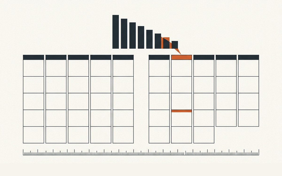
One Wednesday morning, a retail network dashboard reported two unpleasant things. The month had fallen to 86 % of break-even, and it was down 44 % on the month before. Management had already started drawing conclusions.
Both numbers were wrong. Not slightly, and not because the data was dirty. They were wrong because the month was not the length everyone assumed.
A twenty-eight day month compared with a thirty-five day month
The dashboard generator assigned each week to a month by the ISO rule, on the Thursday. A perfectly defensible rule, except that it produces months of very different lengths. The month showing 86 % of break-even covered twenty-eight days. The month it was being compared with covered thirty-five.
Seven days of difference on a base of thirty. The short month's total was mechanically cut by roughly a fifth before anyone looked at the activity at all.
Recalculated on the real calendar month, the result sat between 95 and 100 % of break-even, not 86. And the fall against the previous month was 27 to 30 %, not 44. Half of the bad news did not exist.
The error had already travelled
This is the expensive part. The month-end executive summary had already gone out with the wrong figure and the conclusion that came with it. And the following month's target had been calibrated on it.
That target had been set as a 35 % rise on the actual. On a correct calendar base, the same target was a rise of 16 to 22 %. A whole team was therefore working towards a target whose stated ambition was not the one they believed, in one direction or the other. Nobody can steer with that.
The same dashboard held a second artefact
The weekly view showed the first three months of the year at very low levels, which suggested a disastrous start followed by a recovery. The reality was more ordinary: point-of-sale coverage in the system had only started in week fourteen. Those months were not bad, they were partially instrumented. The real series was three to four times higher.
And break-even itself, the line everything was measured against, circulated verbally as a rounded figure that did not match the sourced calculation. The gap was small, but it applied to the reference for every other number.
What I now check before commenting on any variance
Three checks, in this order, and they take ten minutes.
First, the window. How many days in each period being compared. If the dashboard aggregates by week and reports by month, there will always be twenty-eight day months and thirty-five day months, and the monthly comparison is wrong by construction.
Second, coverage. From what date each source actually feeds the series. Missing data looks exactly like zero performance, and nothing in the chart tells them apart.
Third, the reference. Is the threshold everything is compared against calculated and sourced, or does it travel by oral tradition. In the companies I see, the second answer is more common than the first.
Why this is a marketing subject
Because marketing is the function that comments on variances more than any other. A campaign is up, a campaign is down, a channel drops off. And half the explanations I have heard in my career were about activity when the cause was in the measurement.
A marketing lead who can read an aggregation window gains two things. They avoid celebrating a rise that does not exist, which always surfaces eventually. And they avoid dismantling something that was working, which never surfaces and costs more.
The question to ask before any other, in front of any dashboard: how many days does this column cover, and how many does the one next to it cover.
Going further: the method, and the case study one group budget, nine country budgets, one rule.
Do your dashboards say what you think they say? Request a Growth Audit